Self Portrait: 28/02/24
here is my self-portrait I made using Photoshop. I grabbed different images of myself from the Westminster University trip cropped out the background of the other images and used the brush tool to blend the images into the background of the main one in the middle so that they would fit and merge with the color of the background.
FMP Experimentation Identity Image: 06/03/24 I used Photoshop today to create an image experimentation that would be linked to identity and this is what I came out with. the image is inspired and looks similar to the artwork of April Greiman. the reason I chose to make my image similar to the one made by April is because I found it to be very interesting as the colors and shapes have a great style and symmetry along with how vibrant it looks. both these images relate to identity because of the figure in the middle having their eyes cropped out which can signify anyone being in a painting and how behind the square could be you which is why I love the design of this artwork and tried my best to replicate it but also add my own look to as well.
for my FMP this is what I will strive to try and make a vibrant but clear image with good symmetry and patterns along with shapes and colors to make it stand out.
Mock-up prototypes for FMP poster and website: 14/03/24
here are some prototypes for my website and poster that I'm going to make for my FMP. I tried experimenting with different shapes in my website mockup and implemented a cracking sort of look to both the website image and my mockup poster to showcase an identity crisis.
Website Progress Documentation: 15/04/24

here is what i have created and added to my website so far.
everything is still a work in progress so some parts of my website may still look like the template i chose for the website when i started to make it.
so far each image is original and I'm going to have it stay that way along with making any original images in Photoshop to add to my website as projects or posters to go along with it.
24/04/24:

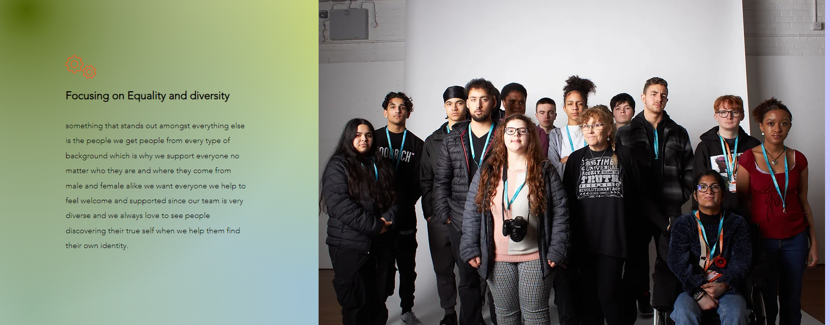
Here are some more images from my website as I have been steadily making progress and adding more things to it in the last few days. the three images above are from the About page on my website and i made sure to keep the information clear and simple whilst adding two really good images that would showcase what my company is about.
the backgrounds around the images and text are ones I chose from Wix and I think they give my website more character and fit with my theme and idea for identity which is helping anyone and everyone who may not know ow who they want to discover their identity as it's colorful and vibrant and connects with the diversity I'm wanting for my website.

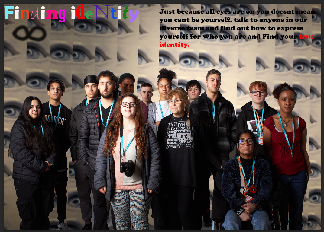
here are the images from the services page on my website. I made sure to add enough pictures and change the background of the website where the text is and add a bunch of information detailing what my website as a company will provide for people.
Posters for my Website:25/04/24
here are some of the posters i have made for my Website that i shall use for my FMP. i tried to keep each one unique but also kept the message and logo for my product the same. the first one one is inspired by various headspace posters as the circles reflect different moods.
this poster represents diversity and especially neurodiversity as i have used the neurodivergent symbol as the main focus of this poster whilst creating a logo for my product. from the feedback i got many people didn't choose this poster as the best one and i probably should've added something else to this poster to make it stand out more since it is the same logo just in different colours on a white backdrop.
Final Website posters and website experimentation: 13/05/24
last week and today ive tried experimenting with different font styles for my website in different colours. im making sure each font works with legibility as i want my website's text to be easy to read and nice to look at since all the different and vibrant colours match with the theme and style of my website and posters. ive also been creating many posters for my website experimenting with different styles colours and fonts with each.
Here are the rest of the posters for my website that I have made:

for this poster, i was trying to replicate an image i had seen in a magazine which i tried recreating with a drawing.
i tried to recreate the scribblings around the main drawing but wanted to change the design in Photoshop which is why i have the hand print in the final poster but I decided to leave out the scribblings as it would have looked bad.
I'm very proud of this one as the different color shades around the image work really well and fit with my theme and logo for my FMP.
I have updated this specific poster from what it used to be and I'm very happy with how it turned out as originally it didn't look very appealing.
this is the original image for comparison I'm happy with how it came out as the change improves on the original poster.
when i received feedback on this poster someone suggested adding someone female to it which gave me the idea of doing a similar poster to this one with a girl having different parts of her body shaded in different colors to represent how we all have different moods all in our body and that we are very diverse on the inside which relates to the theme of my project and the message it is giving. most of the feedback from everyone was that this was the best one.
I made each poster unique and different from the other and I'm happy with how each one turned out. I made sure to connect each one by adding the logo for my website on each one. I also made sure that each poster's text was legible enough and easy to read.
Website Layout: 15/05/24
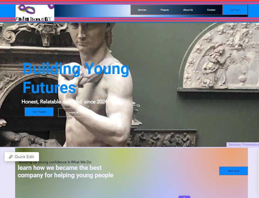
here are images of my nearly complete website which is going to showcase the legibility, style and look of what my website is within this stage of production.
Here are all the parts from the home page of my website.
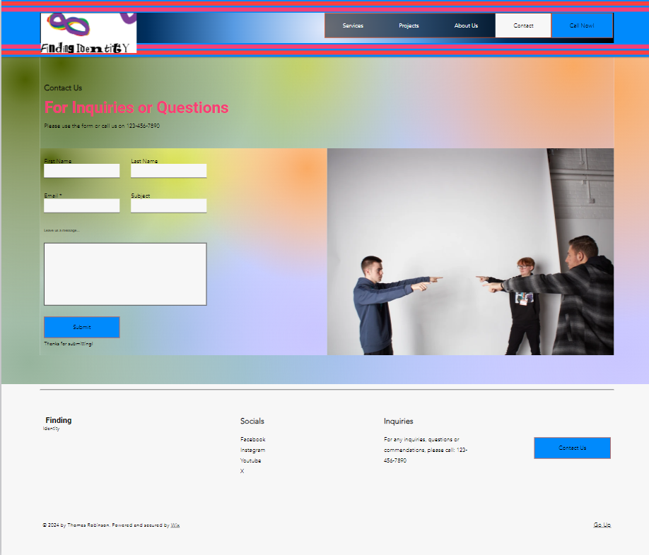
These images will all come from the services page of my Website.
something I would like to change about this page is the legibility as most of the text due to the colour and font are making it hard to read and doesn't quite match with the background which is something i would like to change.some of the images didn't quite fit in the small square boxes which left half the image cropped out so I had to change the position of some images so you could see who was in it rather than just seeing their body on a white backdrop.
these are all the posters I've made for my website
so far each page has had legibility changes and I decided to make the entire background on each page to be the same.


.webp)


No comments:
Post a Comment